This is new in 4human QM365
This is new in 4human QM365
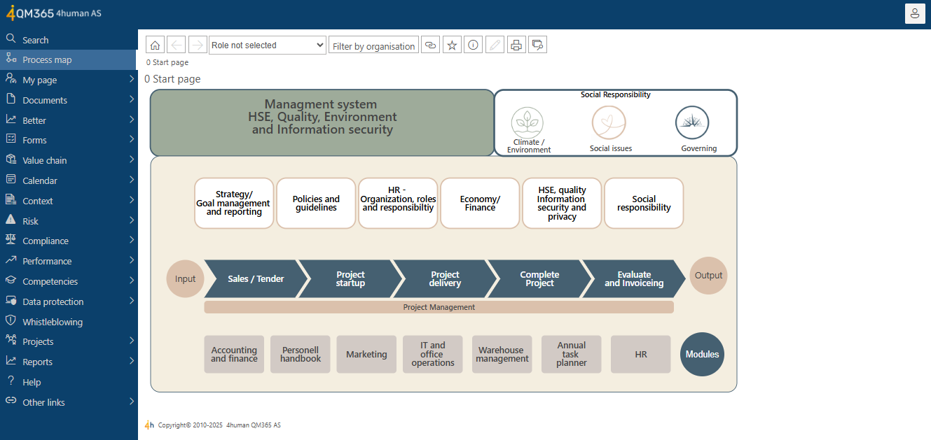
4human QM365 has developed a completely new user interface , with a focus on increased usability, a uniform visual expression across the platform and between 4human's various systems.
The update of 4human QM365 represents a major step forward in both functionality and user experience. With a modern design, smarter navigation, and more flexible tools, the system is now better equipped to support quality and risk management in organizations of all sizes.
New user interface
A modern and more intuitive design that makes it easier to navigate and use the system. The user interface and navigation have been built from the ground up, with a more consistent design across the entire system. This provides a significant improvement in usability and visual consistency. The system now runs as a SharePoint Framework (SPFx) App directly from the customer's App Catalog, which provides better robustness and easier management.

How to see 4human QM365 new user interfaces out

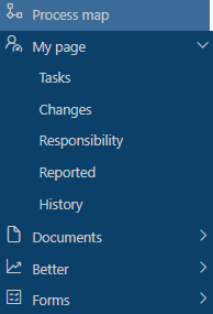
Menu structure with only two levels
The menu structure has been reconstructed to make navigation easier. It is now limited to two levels, and the content is displayed in clear list views in the main window.
Personal views and pages
Users can now customize how they view and organize content to suit their work style and needs.
New design with the option of color customization
Although the design has been updated, colors can still be customized to match your organization's profile.
"My Organization" filter (manual)
Users can now select their organizational affiliation and get views that only show relevant cases for their unit – a major improvement for targeted work.
Risk analysis
The analytics dashboard has been renamed: Risk Analysis , for consistent terminology.
Case management
New subheading in the form for new cases shows the selected category when pre-filling, i.e. when, for example, “Quality” is included from the registration button.
Improved management review
Several improvements have been made to strengthen management review:
- Direct link to risk assessment from relevant sections.
- Foldable sections for better overview.
- Possibility of printing and PDF of both expanded and combined views.
- Autosave is enabled by default.
- New fields and sections provide better overall functionality according to ISO:
- Evaluation of process efficiency.
- Incidents and deviations.
- Results from conformity assessments.
- Employee participation and consultation.
- Assessment of guidelines.
How to get new ones 4human QM365
Follow this guide for what you need to do to get the new version.
Related posts
11 steps to help you choose the right quality system
Investing in a quality system can quickly become a comprehensive process. For example, imagine buying your dream home....
8 practical steps to maintain ISO 9001 certification
8 steps to maintain ISO 9001 certification Ensuring that your ISO 9001 certification remains valid may seem like a...
A guide to quality management trends for 2025
Discover the future of quality management in 2025! The world is changing rapidly, and quality management (QMS) must keep up. New technologies such as...


