
Coming soon: A simpler and more modern 4human HRM
When we launched the personal dashboard, you got a first taste of our new design direction, and now we're excited to take the next step.
In version 20.60, large parts of the solution get a brighter look, clearer structure, and a more holistic user experience. The goal is to make it feel easier to find your way around, understand what requires attention, and move forward with the task you are about to solve.
In short: Less time spent on the system. More time on the people, tasks and decisions that matter most.
This article provides an overview of the most important changes so you can prepare managers and employees before the upgrade.
Haven't read the first article about the redesign? Read more about the background and goals here.
A calmer and more clear expression
The first thing you will notice is that the solution looks different.
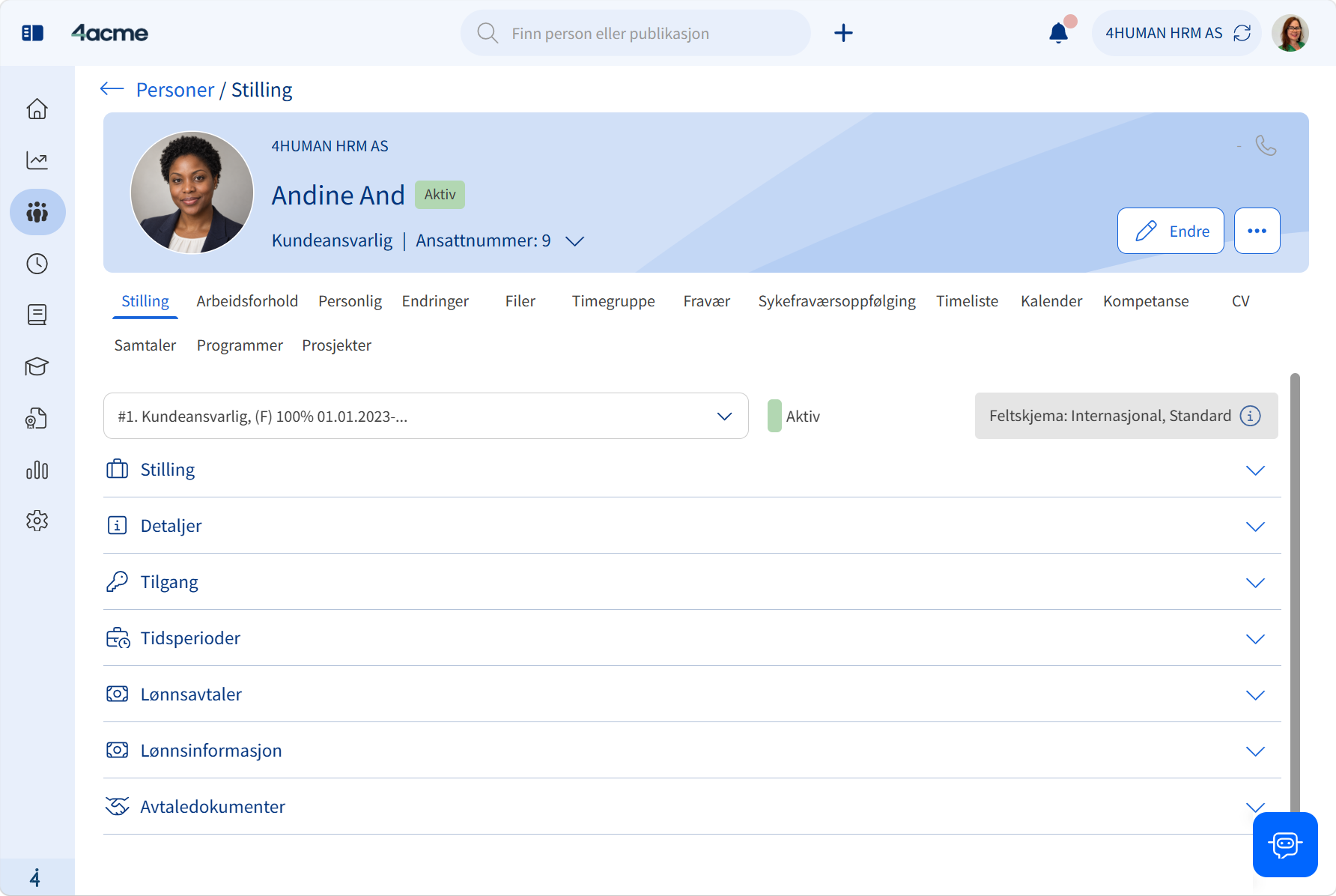
We're introducing a lighter, softer color palette, updated icons, and a more modern look, while maintaining clear contrasts so important actions and key information remain easy to find.
The change is about more than just new colors, though. We want to create a calmer workspace where it's easier to:
- see what requires attention
- understand where you are
- find the next action
- read and interpret information faster
We've also reduced visual noise and improved focus markers and keyboard navigation support, making the solution easier to use for more people.
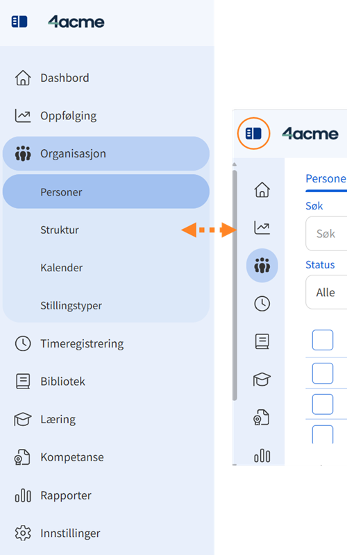
A menu that helps you move forward faster
When you use a solution every day, the little details matter, so we've taken a closer look at how the main menu can be made simpler and more intuitive.
In the new version:
- the button to expand and collapse the menu is moved to the top line
- the menu takes up less space when closed
- the previous main tab is automatically closed when you open a new one
- Get faster access to employee profiles from multiple tables and overviews
This results in less scrolling and fewer detours when moving between different parts of the solution.
Easier to recognize across the solution
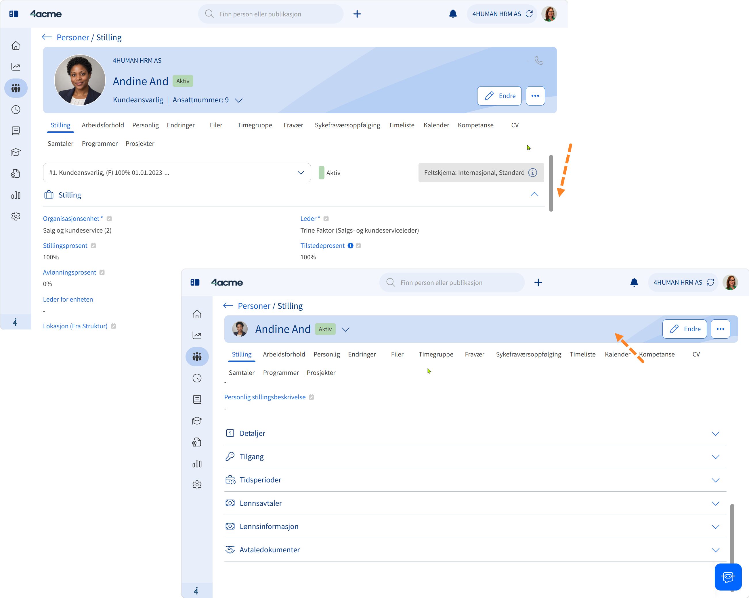
Search, filters, tabs, and action buttons may have previously been positioned slightly differently from page to page. This can mean that you have to spend time reorienting yourself when changing modules or tasks.
In version 20.60, several pages therefore have a common and more logical structure:
Tabs → search and filters → content → actions
This means, among other things, that:
- tabs appear at the top
- Search and filters are all together
- action buttons are consistently placed on the right
- the content is presented in a more recognizable way
When the structure is more consistent across the solution, you know more about where to look. This makes the solution easier to learn and more efficient to use.
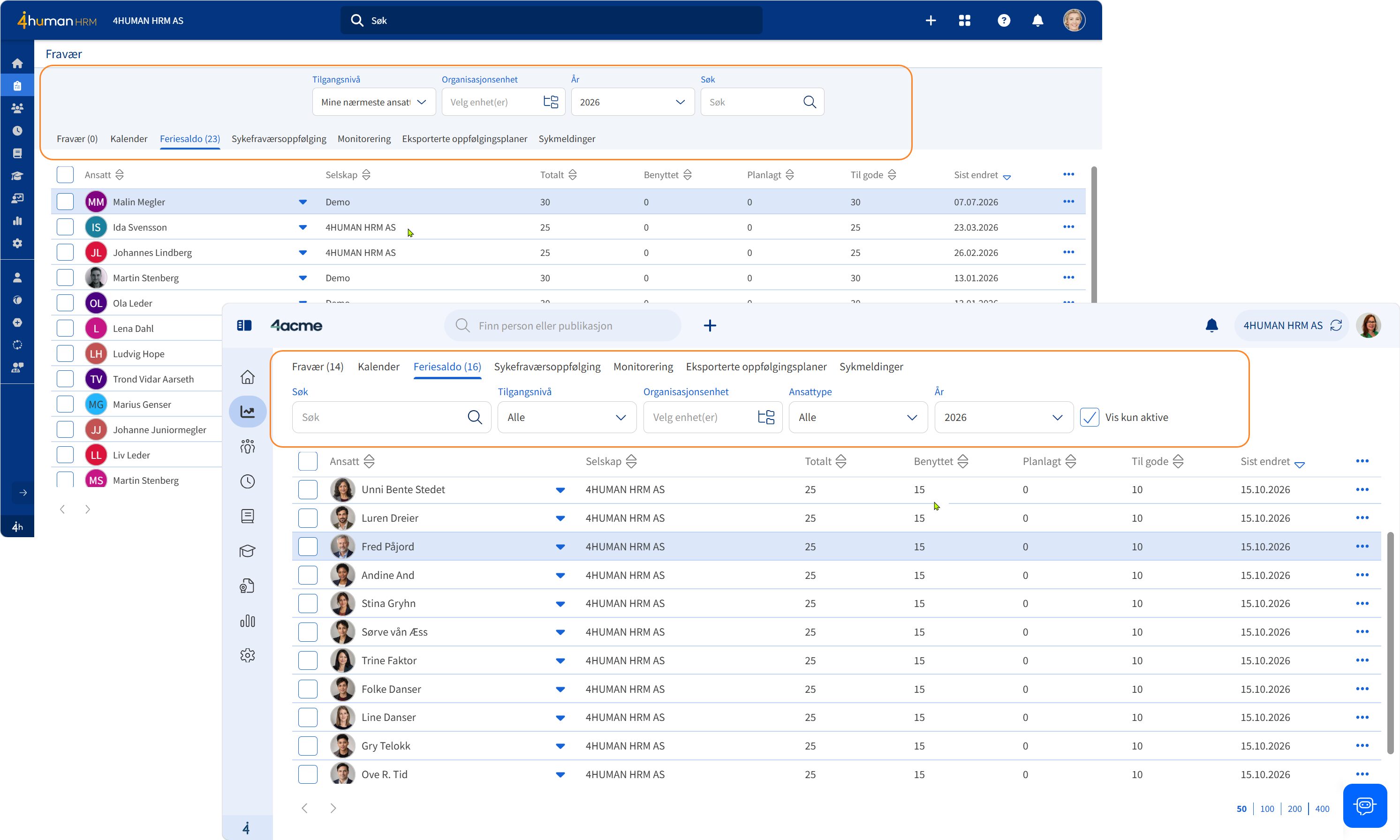
More space for what you're working on
When you open an employee profile, the information in the top bar is useful for giving you an overview. However, once you start scrolling, it's the content further down the page that's most important.
That's why the top bar automatically shrinks as you scroll down, giving the data and tasks you're working on more space on the screen.
It's a small change, but it allows you to see more information without having to scroll as much.
Smarter filtering when searching for information
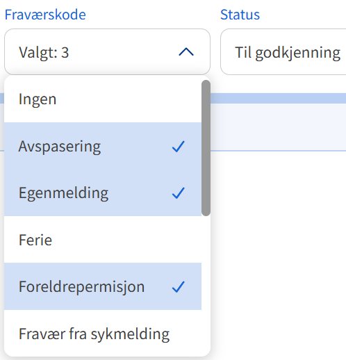
Multiple views will support selecting multiple filter values at the same time.
Instead of searching for one status or group at a time, you can combine multiple options in the same search. For example, you can select multiple statuses at once or narrow down an overview to the employee groups that are relevant to your task.
This gives you greater flexibility and makes it faster to find your way through larger amounts of data.
Clearer help when something is missing
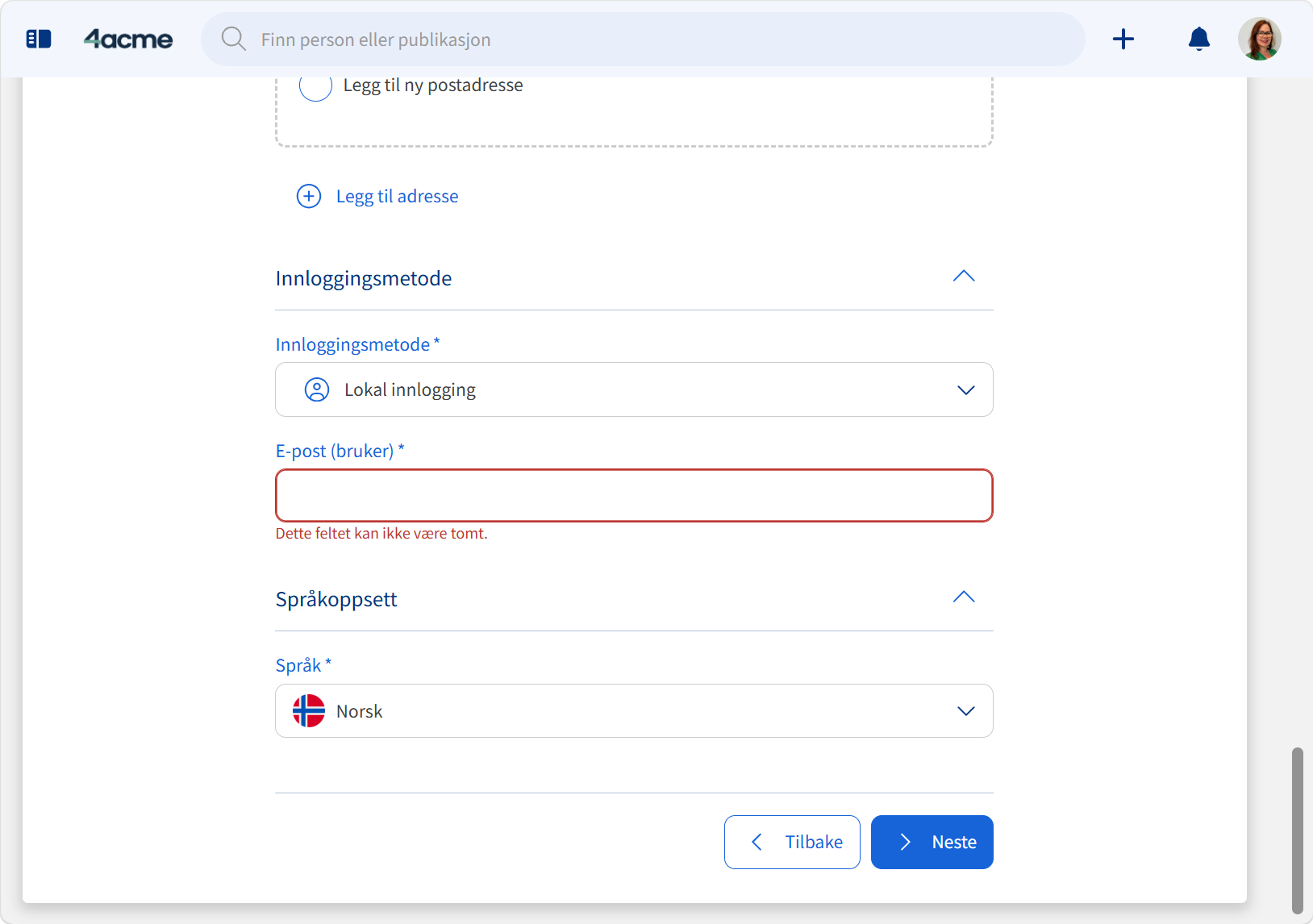
Most people have experienced being told that a form cannot be saved, without it being easy to see what is missing.
We want to do something about that.
When required information is not filled in, the solution will clearly highlight the relevant fields. Instead of having to search for the cause of the error message, you are guided directly to what needs to be corrected.
We can't fill in the information for you, but we can make it easier to see what's left before you can continue.
A dashboard that better suits your workday
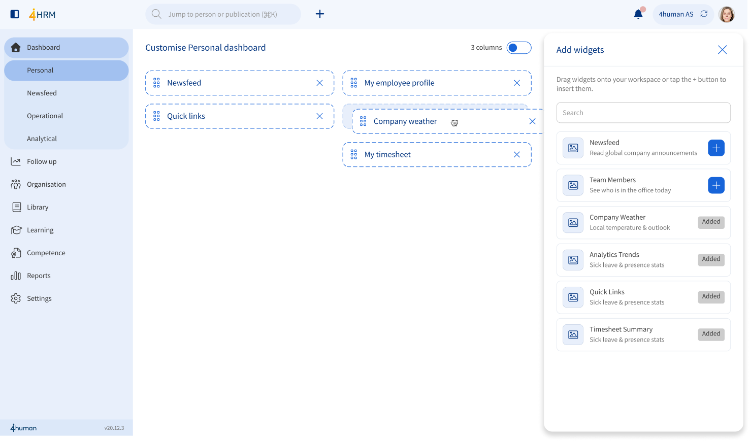
The personal dashboard was the first part of our new design direction, and now you have more freedom to customize it to what's important to you.
You can:
- add and remove widgets
- move widgets with drag-and-drop
- change the order of the content
- choose a view with up to three columns
Some want quick access to pending tasks. Others need an overview of absences, employees or important key figures. With the new options, you can shape the home page more around your own role and work routine.
Updated calendar and absence overviews
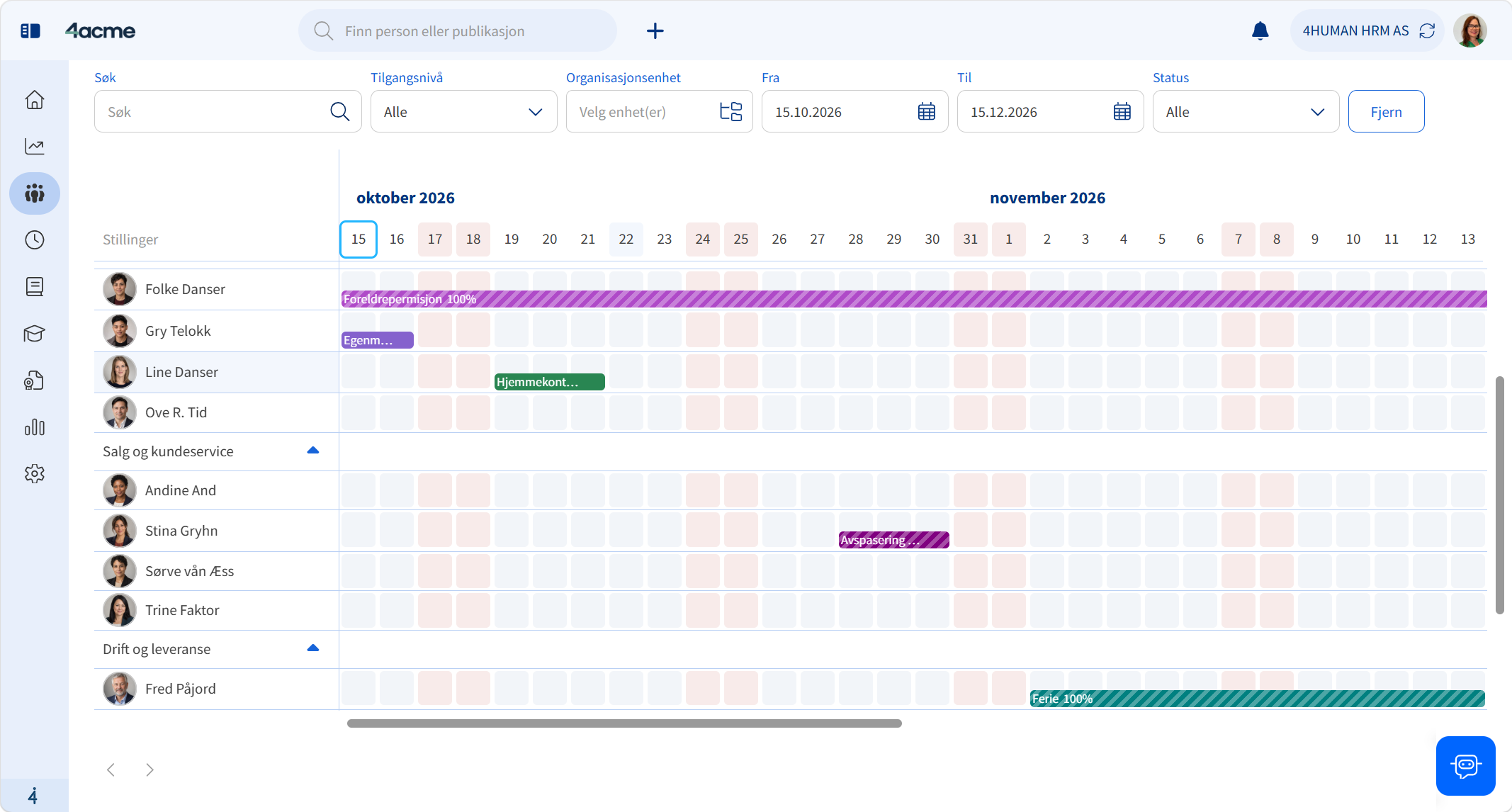
The calendar and absence overviews also get a visual boost.
Clearer markings and better readability should make it easier to get an overview of absences, activities and planned information. From several of the overviews, you can also go directly to an employee profile by clicking on the name.
That means fewer clicks when you need more information about the person you're working with.
An easier start when registering new employees
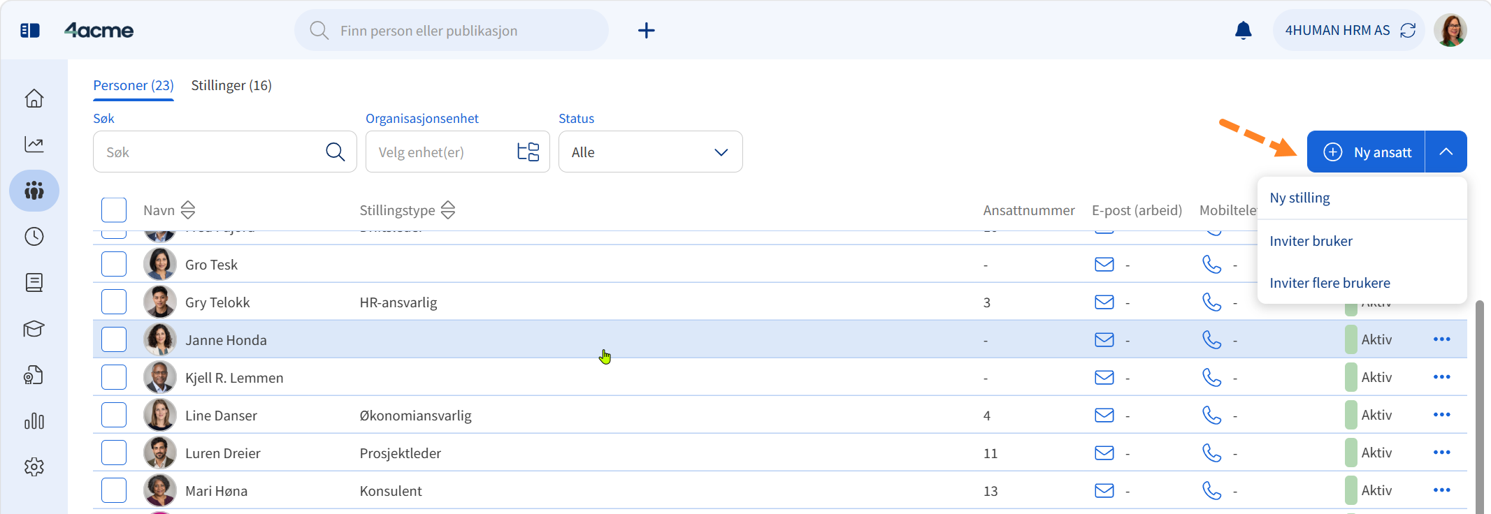
For those of you who register and follow up on new employees, we are introducing a new quick button that brings together several of the most common tasks.
From here you can, among other things:
- register a new employee
- create a position
- invite a user
- invite more users
The goal is to give you a faster path into the task and reduce the number of steps in the onboarding process.
This is what you should do before upgrading
Although the tasks and information will remain familiar, several pages will have a new structure and design. We therefore recommend that system administrators inform managers and employees about the most important changes before version 20.60 is released in November.
A brief orientation beforehand can make the transition safer and help users notice the improvements from day one.
Version 20.60 is an important step in the work to make 4human HRM easier and more comfortable to use. And we're not done yet. We will continue to improve the user experience with the same goal in mind:
Less time spent finding your way. More time for the people, tasks, and decisions that matter most.
Related posts
Optimize your effective HSE transformation with 4human
Join Optimera's journey towards more efficient and digitalized HSE management with 4human Through a modern digital solution, Optimera has...

Protected: Course admission: How to handle new hires, changes and rehires in 4human HRM ?
Password Protected
To view this protected post, enter the password below:

Webinar recording: How a structured approach to sickness absence management can help reduce absenteeism
Pål Kristian EggenSales Manager in 4humanSilje UstadHR Manager in Pipelife